There’s something wrong with this universe.

I’ve gone on about natural philosophy, the philosophy of representation, science history, and the importance of interdisciplinary perspectives when studying modern science. There’s something that unifies all these ideas, and I wouldn’t have thought of it at all hadn’t I spoken to the renowned physicist Dr. George Sterman on January 3.

I was attending the Institute of Mathematical Sciences’ golden jubilee celebrations. A lot of my heroes were there, and believe me when I say my heroes are different from your heroes. I look up to people who are capable of thinking metaphysically, and physicists more than anyone I’ve come to meet are very insightful in that area.

One such physicist is Dr. Ashoke Sen, whose contributions to the controversial area of string theory are nothing short of seminal – if only for how differently it says we can think about our universe and what the math of that would look like. Especially, Sen’s research into tachyon condensation and the phases of string theory is something I’ve been interested in for a while now.

Knowing that George Sterman was around came as a pleasant surprise. Sterman was Sen’s doctoral guide; while Sen’s a string theorist now, his doctoral thesis was in quantum chromodynamics, a field in which the name of Sterman is quite well-known.


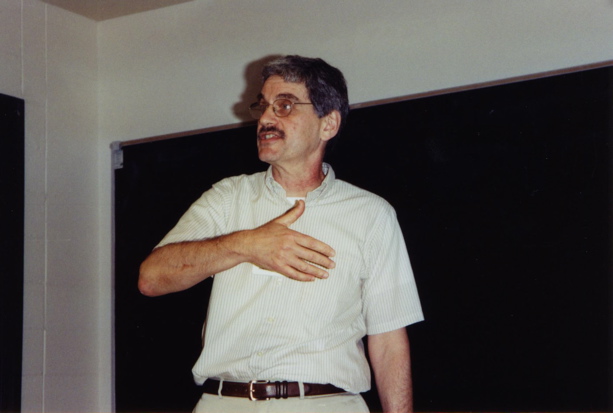
– DR. GEORGE STERMAN (IMAGE: UC DAVIS)

When I finally got a chance to speak with Sterman, it was about 5 pm and there were a lot of mosquitoes around. We sat down in the middle of the lawn on a couple of old chairs, and with a perpetual smile on his face that made one of the greatest thinkers of our time look like a kid in a candy store, Sterman jumped right into answering my first question on what he felt about the discovery of a Higgs-like boson.

Where Sheldon Stone was obstinately practical, Sterman was courageously aesthetic. After the (now usual) bit about how the discovery of the boson was a tribute to mathematics and its ability to defy 50 years of staggering theoretical advancements by remaining so consistent, he said, “But let’s think about naturalness for a second…”

The moment he said “naturalness”, I knew what he was getting it, but more than anything else, I was glad. Here was a physicist who was still looking at things aesthetically, especially in an era where lack of money and the loss of practicality by extension could really put the brakes on scientific discovery. I mean it’s easy to jump up and down and be excited about having spotted the Higgs, but there are very few who feel free to still not be happy.

In Sterman’s words, uttered while waving his arms about to swat away the swarming mosquitoes while discussing supersymmetry:

There’s a reason why so many people felt so confident about supersymmetry. It wasn’t just that it’s a beautiful theory – which it is – or that it engages and challenges the most mathematically oriented among physicists, but in another sense in which it appeared to be necessary. There’s this subtle concept that goes by the name of naturalness. Naturalness as it appears in the Standard Model says that if we gave our any reasonable estimate of what the mass of the Higgs particle should be, it should by all rights be huge! It should be as heavy as what we call the Planck mass [~10^19 GeV].”

Or, as Martinus Veltman put it in an interview to Matthew Chalmers for Nature,

Since the energy of the Higgs is distributed all over the universe, it should contribute to the curvature of space; if you do the calculation, the universe would have to curve to the size of a football.

Naturalness is the idea in particle physics specifically, and in nature generally, that things don’t desire to stand out in any way unless something’s really messed up. For instance, consider the mass hierarchy problem in physics: Why is the gravitational force so much more weaker than the electroweak force? If either of them is a fundamental force of nature, then where is the massive imbalance coming from?

Formulaically speaking, naturalness is represented by this equation:

Here, lambda (the mountain) is the cut-off scale, an energy scale at which the theory breaks down. Its influence over the naturalness of an entity h is determined by how many dimensions lambda acts on – with a maximum of 4. Last, c is the helpful scaling constant that keeps lambda from being too weak or too strong in some setting.

In other words, a natural constant h must be comparable to other nature constants like it if they’re all acting in the same setting.

(TeX: hquad =quad c{ Lambda }^{ 4quad -quad d })

However, given how the electroweak and gravitational forces – which do act in the same setting (also known as our universe) – differ so tremendously in strength, the values of these constants are, to put it bluntly, coincidental.

Problems such as this “violate” naturalness in a way that defies the phenomenological aesthetic of physics. Yes, I’m aware this sounds like hot air but bear with me. In a universe that contains one stupendously weak force and one stupendously strong force, one theory that’s capable of describing both forces would possess two disturbing characteristics:

1. It would be capable of angering one William of Ockham

2. It would require a dirty trick called fine-tuning

I’ll let you tackle the theories of that William of Ockham and go right on to fine-tuning. In an episode of ‘The Big Bang Theory’, Dr. Sheldon Cooper drinks coffee for what seems like the first time in his life and goes berserk. One of the things he touches upon in a caffeine-induced rant is a notion related to the anthropic principle.

The anthropic principle states that it’s not odd that the value of the fundamental constants seem to engender the evolution of life and physical consciousness because if those values aren’t what they are, then a consciousness wouldn’t be able to observe them. Starting with the development of the Standard Model of particle physics in the 1960s, it’s become known that these constants are really fine in their value.

So, with the anthropic principle providing a philosophical cushioning, like some intellectual fodder to fall back on when thoughts run low, physicists set about trying to find out why the values are what they are. As the Standard Model predicted more particles – with annoying precision – physicists also realised that given the physical environment, the universe would’ve been drastically different even if the values were slightly off.

Now, as discoveries poured in and it became clear that the universe housed two drastically different forces in terms of their strength, researchers felt the need to fine-tune the values of the constants to fit experimental observations. This sometimes necessitated tweaking the constants in such a way that they’d support the coexistence of the gravitational and electroweak forces!

Scientifically speaking, this just sounds pragmatic. But just think aesthetically and you start to see why this practice smells bad: The universe is explicable only if you make extremely small changes to certain numbers, changes you wouldn’t have made if the universe wasn’t concealing something about why there was one malnourished kid and one obese kid.


Doesn’t the asymmetry bother you?

Put another way, as physicist Paul Davies did,

There is now broad agreement among physicists and cosmologists that the Universe is in several respects ‘fine-tuned’ for life. The conclusion is not so much that the Universe is fine-tuned for life; rather it is fine-tuned for the building blocks and environments that life requires.

(On a lighter note: If the universe includes both a plausible anthropic principle and a Paul Davies who is a physicist and is right, then multiple universes are a possibility. I’ll let you work this one out.)

Compare all of this to the desirable idea of naturalness and what Sterman was getting at and you’d see that the world around us isn’t natural in any sense. It’s made up of particles whose properties we’re sure of, of objects whose behaviour we’re sure of, but also of forces whose origins indicate an amount of unnaturalness… as if something outside this universe poked a finger in, stirred up the particulate pea-soup, and left before anyone evolved enough to get a look.

(This blog post first appeared at The Copernican on January 6, 2013.)

The case of the red-haired kids

This blog post first appeared, as written by me, on The Copernican science blog on December 30, 2012.

Seriously, shame on me for not noticing the release of a product named Correlate until December 2012. Correlate by Google was released in May last year and is a tool to see how two different search trends have panned out over a period of time. But instead of letting you pick out searches and compare them, Correlate saves a bit of time by letting you choose one trend and then automatically picks out trends similar to the one you’ve your eye on.

For instance, I used the “Draw” option and drew a straight, gently climbing line from September 19, 2004, to July 24, 2011 (both randomly selected). Next, I chose “India” as the source of search queries for this line to be compared with, and hit “Correlate”. Voila! Google threw up 10 search trends that varied over time just as my line had.

correlate_date

Since I’ve picked only India, the space from which the queries originate remains fixed, making this a temporal trend – a time-based one. If I’d fixed the time – like a particular day, something short enough to not produce strong variations – then it’d have been a spatial trend, something plottable on a map.

Now, there were a lot of numbers on the results page. The 10 trends displayed in fact were ranked according to a particular number “r” displayed against them. The highest ranked result, “free english songs”, had r = 0.7962. The lowest ranked result, “to 3gp converter”, had r = 0.7653.

correlations

And as I moused over the chart itself, I saw two numbers, one each against the two trends being tracked. For example, on March 1, 2009, the “Drawn Series” line had a number +0.701, and the “free english songs” line had a number -0.008, against it.

correlate_zoom

What do these numbers mean?

This is what I want to really discuss because they have strong implications on how lay people interpret data that appears in the context of some scientific text, like a published paper. Each of these numbers is associated with a particular behaviour of some trend at a specific point. So, instead of looking at it as numbers and shapes on a piece of paper, look at it for what it represents and you’ll see so many possibilities coming to life.

The numbers against the trends, +0.701 for “Drawn Series” (my line) and -0.008 for “free english songs” in March ‘09, are the deviations. The deviation is a lovely metric because it sort of presents the local picture in comparison to the global picture, and this perspective is made possible by the simple technique used to evaluate it.

Consider my line. Each of the points on the line has a certain value. Use this information to find their average value. Now, the deviation is how much a point’s value is away from the average value.

It’s like if 11 red-haired kids were made to stand in a line ordered according to the redness of their hair. If the “average” colour around was a perfect orange, then the kid with the “reddest” hair and the kid with the palest-red hair will be the most deviating. Kids with some semblance of orange in their hair-colour will be progressively less deviating until they’re past the perfect “orangeness”, and the kid with perfectly-orange hair will completely non-deviating.

So, on August 23, 2009, “Drawn Series” was higher than its average value by 0.701 and “free english songs” was lower than its average value by 0.008. Now, if you’re wondering what the units are to measure these numbers: Deviations are dimensionless fractions – which means they’re just numbers whose highness or lowness are indications of intensity.

And what’re they fractions of? The value being measured along the trend being tracked.

Now, enter standard deviation. Remember how you found the average value of a point on my line? Well, the standard deviation is the average value among all deviations. It’s like saying the children fitting a particular demographic are, for instance, 25 per cent smarter on average than other normal kids: the standard deviation is 25 per cent and the individual deviations are similar percentages of the “smartness” being measured.

So, right now, if you took the bigger picture, you’d see the chart, the standard deviation (the individual deviations if you chose to mouse-over), the average, and that number “r”. The average will indicate the characteristic behaviour of the trend – let’s call it “orange” – the standard deviation will indicate how far off on average a point’s behaviour will be deviating in comparison to “orange” – say, “barely orange”, “bloody”, etc. – and the individual deviations will show how “orange” each point really is.

At this point I must mention that I conveniently oversimplified the example of the red-haired kids to avoid a specific problem. This problem has been quite single-handedly responsible for the news-media wrongly interpreting results from the LHC/CERN on the Higgs search.

In the case of the kids, we assumed that, going down the line, each kid’s hair would get progressively darker. What I left out was how much darker the hair would get with each step.

Let’s look at two different scenarios.

Scenario 1: The hair gets darker by a fixed amount each step.

Let’s say the first kid’s got hair that’s 1 units of orange, the fifth kid’s got 5 units, and the 11th kid’s got 11 units. This way, the average “amount of orange” in the lineup is going to be 6 units. The deviation on either side of kid #6 is going to increase/decrease in steps of 1. In fact, from the first to the last, it’s going to be 5, 4, 3, 2, 1, 0, 1, 2, 3, 4, and 5. Straight down and then straight up.

blue_bars

Scenario 2: The hair gets darker slowly and then rapidly, also from 1 to 11 units.

In this case, the average is not going to be 6 units. Let’s say the “orangeness” this time is 1, 1.5, 2, 2.5, 3, 3.5, 4, 5.5, 7.5, 9.75, and 11 per kid, which brings the average to ~4.6591 units. In turn, the deviations are 3.6591, 3.1591, 2.6591, 2, 1591, 1.6591, 1.1591, 0.6591, 0.8409, 2.8409, 5.0909, and 6.3409. In other words, slowly down and then quickly more up.

red_bars

In the second scenario, we saw how the average got shifted to the left. This is because there were more less-orange kids than more-orange ones. What’s more important is that it didn’t matter if the kids on the right had more more-orange hair than before. That they were fewer in number shifted the weight of the argument away from them!

In much the same way, looking for the Higgs boson from a chart that shows different peaks (number of signature decay events) at different points (energy levels), with taller but fewer peaks to one side and shorter but many more peaks to the other, can be confusing. While more decays could’ve occurred at discrete energy levels, the Higgs boson is more likely (note: not definitely) to be found within the energy-level where decays occur more frequently (in the chart below, decays are seen to occur more frequently at 118-126 GeV/c2 than at 128-138 GeV/c2 or 110-117 GeV/c2).

incidence
Idea from Prof. Matt Strassler’s blog

If there’s a tall peak where a Higgs isn’t likely to occur, then that’s an outlier, a weirdo who doesn’t fit into the data. It’s probably called an outlier because its deviation from the average could be well outside the permissible deviation from the average.

This also means it’s necessary to pick the average from the right area to identify the right outliers. In the case of the Higgs, if its associated energy-level (mass) is calculated as being an average of all the energy levels at which a decay occurs, then freak occurrences and statistical noise are going to interfere with the calculation. But knowing that some masses of the particle have been eliminated, we can constrain the data to between two energy levels, and then go after the average.

So, when an uninformed journalist looks at the data, the taller peaks can catch the eye, even run away with the ball. But look out for the more closely occurring bunches – that’s where all the action is!

If you notice, you’ll also see that there are no events at some energy levels. This is where you should remember that uncertainty cuts both ways. When you’re looking at a peak and thinking “This can’t be it; there’s some frequency of decays to the bottom, too”, you’re acknowledging some uncertainty in your perspective. Why not acknowledge some uncertainty when you’re noticing absent data, too?

While there’s a peak at 126 GeV/c2, the Higgs weighs between 124-125 GeV/c2. We know this now, so when we look at the chart, we know we were right in having been uncertain about the mass of the Higgs being 126 GeV/c2. Similarly, why not say “There’s no decays at 113 GeV/c2, but let me be uncertain and say there could’ve been a decay there that’s escaped this measurement”?

Maybe this idea’s better illustrated with this chart.

incidence_valley

There’s a noticeable gap between 123 and 125 GeV/c2. Just looking at this chart and you’re going to think that with peaks on either side of this valley, the Higgs isn’t going to be here… but that’s just where it is! So, make sure you address uncertainty when you’re determining presences as well as absences.

So, now, we’re finally ready to address “r”, the Pearson covariance coefficient. It’s got a formula, and I think you should see it. It’s pretty neat.

daum_equation_1356801915634

(TeX: rquad =quad frac { { Sigma }_{ i=1 }^{ n }({ X }_{ i }quad -quad overset { _ }{ X } )({ Y }_{ i }quad -quad overset { _ }{ Y } ) }{ sqrt { { Sigma }_{ i=1 }^{ n }{ ({ X }_{ i }quad -quad overset { _ }{ X } ) }^{ 2 } } sqrt { { Sigma }_{ i=1 }^{ n }{ (Y_{ i }quad -quad overset { _ }{ Y } ) }^{ 2 } } })

The equation says “Let’s see what your Pearson covariance, “r”, is by seeing how much all of your variations are deviant keeping in mind both your standard deviations.”

The numerator is what’s called the covariance, and the denominator is basically the product of the standard deviations. X-bar, which is X with a bar atop, is the average value of X – my line – and the same goes for Y-bar, corresponding to Y – “mobile games”. Individual points on the lines are denoted with the subscript “i”, so the points would be X1, X2, X3, …, and Y1, Y2, Y3, …”n” in the formula is the size of the sample – the number of days over which we’re comparing the two trends.

The Pearson covariance coefficient is not called the Pearson deviation coefficient, etc., because it normalises the graph’s covariance. Simply put, covariance is a measure of how much the two trends vary together. It can have a minimum value of 0, which would mean one trend’s variation has nothing to do with the other’s, and a maximum value of 1, which would mean one trend’s variation is inescapably tied with the variation of the other’s. Similarly, if the covariance is positive, it means that if one trend climbs, the other would climb, too. If the covariance is negative, then one trend’s climbing would mean the other’s descending (In the chart below, between Oct ’09 and Jan ’10, there’s a dip: even during the dive-down, the blue line is on an increasing note – here, the local covariance will be negative).

correlate_sample

Apart from being a conveniently defined number, covariance also records a trend’s linearity. In statistics, linearity is a notion that stands by its name: like a straight line, the rise or fall of a trend is uniform. If you divided up the line into thousands of tiny bits and called each one on the right the “cause” and the one on the left the “effect”, then you’d see that linearity means each effect for each cause is either an increase or a decrease by the same amount.

Just like that, if the covariance is a lower positive number, it means one trend’s growth is also the other trend’s growth, and in equal measure. If the covariance is a larger positive number, you’d have something like the butterfly effect: one trend moves up by an inch, the other shoots up by a mile. This you’ll notice is a break from linearity. So if you plotted the covariance at each point in a chart as a chart by itself, one look will tell you how the relationship between the two trends varies over time (or space).

The case of the red-haired kids

Seriously, shame on me for not noticing the release of a product named Correlate until December 2012. Correlate by Google was released in May last year and is a tool to see how two different search trends have panned out over a period of time. But instead of letting you pick out searches and compare them, Correlate saves a bit of time by letting you choose one trend and then automatically picks out trends similar to the one you’ve your eye on.

For instance, I used the “Draw” option and drew a straight, gently climbing line from September 19, 2004, to July 24, 2011 (both randomly selected). Next, I chose “India” as the source of search queries for this line to be compared with, and hit “Correlate”. Voila! Google threw up 10 search trends that varied over time just as my line had.

Since I’ve picked only India, the space from which the queries originate remains fixed, making this a temporal trend – a time-based one. If I’d fixed the time – like a particular day, something short enough to not produce strong variations – then it’d have been a spatial trend, something plottable on a map.

Now, there were a lot of numbers on the results page. The 10 trends displayed in fact were ranked according to a particular number “r” displayed against them. The highest ranked result, “free english songs”, had r = 0.7962. The lowest ranked result, “to 3gp converter”, had r = 0.7653.

And as I moused over the chart itself, I saw two numbers, one each against the two trends being tracked. For example, on March 1, 2009, the “Drawn Series” line had a number +0.701, and the “free english songs” line had a number -0.008, against it.

What do these numbers mean?

This is what I want to really discuss because they have strong implications on how lay people interpret data that appears in the context of some scientific text, like a published paper. Each of these numbers is associated with a particular behaviour of some trend at a specific point. So, instead of looking at it as numbers and shapes on a piece of paper, look at it for what it represents and you’ll see so many possibilities coming to life.

The numbers against the trends, +0.701 for “Drawn Series” (my line) and -0.008 for “free english songs” in March ‘09, are the deviations. The deviation is a lovely metric because it sort of presents the local picture in comparison to the global picture, and this perspective is made possible by the simple technique used to evaluate it.

Consider my line. Each of the points on the line has a certain value. Use this information to find their average value. Now, the deviation is how much a point’s value is away from the average value.

It’s like if 11 red-haired kids were made to stand in a line ordered according to the redness of their hair. If the “average” colour around was a perfect orange, then the kid with the “reddest” hair and the kid with the palest-red hair will be the most deviating. Kids with some semblance of orange in their hair-colour will be progressively less deviating until they’re past the perfect “orangeness”, and the kid with perfectly-orange hair will completely non-deviating.

So, on August 23, 2009, “Drawn Series” was higher than its average value by 0.701 and “free english songs” was lower than its average value by 0.008. Now, if you’re wondering what the units are to measure these numbers: Deviations are dimensionless fractions – which means they’re just numbers whose highness or lowness are indications of intensity.

And what’re they fractions of? The value being measured along the trend being tracked.

Now, enter standard deviation. Remember how you found the average value of a point on my line? Well, the standard deviation is the average value among all deviations. It’s like saying the children fitting a particular demographic are, for instance, 25 per cent smarter on average than other normal kids: the standard deviation is 25 per cent and the individual deviations are similar percentages of the “smartness” being measured.

So, right now, if you took the bigger picture, you’d see the chart, the standard deviation (the individual deviations if you chose to mouse-over), the average, and that number “r”. The average will indicate the characteristic behaviour of the trend – let’s call it “orange” – the standard deviation will indicate how far off on average a point’s behaviour will be deviating in comparison to “orange” – say, “barely orange”, “bloody”, etc. – and the individual deviations will show how “orange” each point really is.

At this point I must mention that I conveniently oversimplified the example of the red-haired kids to avoid a specific problem. This problem has been quite single-handedly responsible for the news-media wrongly interpreting results from the LHC/CERN on the Higgs search.

In the case of the kids, we assumed that, going down the line, each kid’s hair would get progressively darker. What I left out was how much darker the hair would get with each step.

Let’s look at two different scenarios.

Scenario 1The hair gets darker by a fixed amount each step.

Let’s say the first kid’s got hair that’s 1 units of orange, the fifth kid’s got 5 units, and the 11th kid’s got 11 units. This way, the average “amount of orange” in the lineup is going to be 6 units. The deviation on either side of kid #6 is going to increase/decrease in steps of 1. In fact, from the first to the last, it’s going to be 5, 4, 3, 2, 1, 0, 1, 2, 3, 4, and 5. Straight down and then straight up.

Scenario 2The hair gets darker slowly and then rapidly, also from 1 to 11 units.

In this case, the average is not going to be 6 units. Let’s say the “orangeness” this time is 1, 1.5, 2, 2.5, 3, 3.5, 4, 5.5, 7.5, 9.75, and 11 per kid, which brings the average to ~4.6591 units. In turn, the deviations are 3.6591, 3.1591, 2.6591, 2, 1591, 1.6591, 1.1591, 0.6591, 0.8409, 2.8409, 5.0909, and 6.3409. In other words, slowly down and then quickly more up.

In the second scenario, we saw how the average got shifted to the left. This is because there were more less-orange kids than more-orange ones. What’s more important is that it didn’t matter if the kids on the right had more more-orange hair than before. That they were fewer in number shifted the weight of the argument away from them!

In much the same way, looking for the Higgs boson from a chart that shows different peaks (number of signature decay events) at different points (energy levels), with taller but fewer peaks to one side and shorter but many more peaks to the other, can be confusing. While more decays could’ve occurred at discrete energy levels, the Higgs boson is more likely (note: not definitely) to be found within the energy-level where decays occur more frequently (in the chart below, decays are seen to occur more frequently at 118-126 GeV/c2 than at 128-138 GeV/c2 or 110-117 GeV/c2).

If there’s a tall peak where a Higgs isn’t likely to occur, then that’s an outlier, a weirdo who doesn’t fit into the data. It’s probably called an outlier because its deviation from the average could be well outside the permissible deviation from the average.

This also means it’s necessary to pick the average from the right area to identify the right outliers. In the case of the Higgs, if its associated energy-level (mass) is calculated as being an average of all the energy levels at which a decay occurs, then freak occurrences and statistical noise are going to interfere with the calculation. But knowing that some masses of the particle have been eliminated, we can constrain the data to between two energy levels, and then go after the average.

So, when an uninformed journalist looks at the data, the taller peaks can catch the eye, even run away with the ball. But look out for the more closely occurring bunches – that’s where all the action is!

If you notice, you’ll also see that there are no events at some energy levels. This is where you should remember that uncertainty cuts both ways. When you’re looking at a peak and thinking “This can’t be it; there’s some frequency of decays to the bottom, too”, you’re acknowledging some uncertainty in your perspective. Why not acknowledge some uncertainty when you’re noticing absent data, too?

While there’s a peak at 126 GeV/c2, the Higgs weighs between 124-125 GeV/c2. We know this now, so when we look at the chart, we know we were right in having been uncertain about the mass of the Higgs being 126 GeV/c2. Similarly, why not say “There’s no decays at 113 GeV/c2, but let me be uncertain and say there could’ve been a decay there that’s escaped this measurement”?

Maybe this idea’s better illustrated with this chart.

– IDEA FROM Prof. Matt Strassler’s blog

There’s a noticeable gap between 123 and 125 GeV/c2. Just looking at this chart and you’re going to think that with peaks on either side of this valley, the Higgs isn’t going to be here… but that’s just where it is! So, make sure you address uncertainty when you’re determining presences as well as absences.

So, now, we’re finally ready to address “r”, the Pearson covariance coefficient. It’s got a formula, and I think you should see it. It’s pretty neat.

(TeX: rquad =quad frac { { Sigma }_{ i=1 }^{ n }({ X }_{ i }quad -quad overset { _ }{ X } )({ Y }_{ i }quad -quad overset { _ }{ Y } ) }{ sqrt { { Sigma }_{ i=1 }^{ n }{ ({ X }_{ i }quad -quad overset { _ }{ X } ) }^{ 2 } } sqrt { { Sigma }_{ i=1 }^{ n }{ (Y_{ i }quad -quad overset { _ }{ Y } ) }^{ 2 } } })

The equation says “Let’s see what your Pearson covariance, “r“, is by seeing how much all of your variations are deviant keeping in mind both your standard deviations.”

The numerator is what’s called the covariance, and the denominator is basically the product of the standard deviations. X-bar, which is X with a bar atop, is the average value of X – my line – and the same goes for Y-bar, corresponding to Y – “mobile games”. Individual points on the lines are denoted with the subscript “i”, so the points would be X1, X2, X3, …, and Y1, Y2, Y3, …”n” in the formula is the size of the sample – the number of days over which we’re comparing the two trends.

The Pearson covariance coefficient is not called the Pearson deviation coefficient, etc., because it normalises the graph’s covariance. Simply put, covariance is a measure of how much the two trends vary together. It can have a minimum value of 0, which would mean one trend’s variation has nothing to do with the other’s, and a maximum value of 1, which would mean one trend’s variation is inescapably tied with the variation of the other’s. Similarly, if the covariance is positive, it means that if one trend climbs, the other would climb, too. If the covariance is negative, then one trend’s climbing would mean the other’s descending (In the chart below, between Oct ’09 and Jan ’10, there’s a dip: even during the dive-down, the blue line is on an increasing note – here, the local covariance will be negative).

Apart from being a conveniently defined number, covariance also records a trend’s linearity. In statistics, linearity is a notion that stands by its name: like a straight line, the rise or fall of a trend is uniform. If you divided up the line into thousands of tiny bits and called each one on the right the “cause” and the one on the left the “effect”, then you’d see that linearity means each effect for each cause is either an increase or a decrease by the same amount.

Just like that, if the covariance is a lower positive number, it means one trend’s growth is also the other trend’s growth, and in equal measure. If the covariance is a larger positive number, you’d have something like the butterfly effect: one trend moves up by an inch, the other shoots up by a mile. This you’ll notice is a break from linearity. So if you plotted the covariance at each point in a chart as a chart by itself, one look will tell you how the relationship between the two trends varies over time (or space).

Dr. Stone on the Higgs search

On December 10, 2012, I spoke to a bunch of physicists attending the Frontiers of High-energy Physics symposium at the Institute of Mathematical Sciences, Chennai. They included Rahul Sinha, G. Rajasekaran, Tom Kibble, Sheldon Stone, Marina Artuso, M.V.N. Murthy, Kajari Mazumdar, and Hai-Yang Cheng, amongst others.

All their talks, obviously, focused on either the search for the Higgs boson or the search for dark matter, with the former being assured and celebratory and the latter, contemplative and cautious. There was nothing new left to be said – as a peg for a news story – given that what of 2012 had gone before that day had already read hundreds of stories on the two searches.

Most of the memorable statements by physicists I remember from that day came from Dr. Sheldon Stone, Syracuse University, and member, LHCb collaboration.

A word on the LHCb before I go any further: It’s one of the seven detector-experiments situated on the Large Hadron Collider’s (LHC’s) ring. Unlike the ATLAS and CMS, whose focus is on the Higgs boson, the LHCb collaboration is studying the decay of B-mesons and signs of CP-symmetry violations at high energies.

While he had a lot to say, he also best summed up what physicists worldwide might’ve felt when the theorised set of particles’ rules called the Standard Model (SM) was having its predictions validated one after the other, leaving no room for a new theory to edge its way in. While very elegant by itself, the SM has no answers to some of the more puzzling questions, such as that of dark matter or of mass-hierarchy problem.

In other words, the more it stands validated, the fewer cracks there are for a new and better theory, like Supersymmetry, to show itself.

In Dr. Stone’s words, “It’s very depressing. The Standard Model has been right on target, and so far, nothing outside the model has been observed. It’s very surprising that everything works, but at the same time, we don’t know why it works! Everywhere, physicists are depressed and clueless, intent on digging deeper, or both. I’m depressed, too, but I also want to dig deeper.”

In answer to some of my questions on what the future held, Dr. Stone said, “Now that we know how things actually work, we’re starting to play some tricks. But beyond that, moving ahead, with new equipment, etc., is going to cost a lot of money. We’ve to invest in the collider, in a lot of detector infrastructure, and computing accessories. In 2012, we had a tough time keeping with the results the LHC was producing. For the future, we’re counting on advancements in computer science and the LHC Grid.”

One interesting thing that he mentioned in one of his answers was that the LHC costs less than one aircraft-carrier. I thought that’d put things in perspective – how much some amount of investment in science could achieve when compared to what the same amount could achieve in other areas. This is not to discourage the construction of aircraft carriers, but to rethink the opportunities science research has the potential to unravel.

(This blog post first appeared at The Copernican on December 22, 2012.)

Is there only one road to revolution?

Read this first.

mk

Some of this connects, some of it doesn’t. Most of all, I have discovered a fear in me that keeps me from from disagreeing with people like Meena Kandasamy – great orators, no doubt, but what are they really capable of?

The piece speaks of revolution as being the sole goal of an Indian youth’s life, that we must spend our lives stirring the muddied water, exposing the mud to light, and separating grime from guts and guts from guts from glory. This is where I disagree. Revolution is not my cause. I don’t want to stir the muddied water. I concede that I am afraid that I will fail.

And at this point, Meena Kandasamy would have me believe, I should either crawl back into my liberty-encrusted shell or lay down my life. Why should I when I know I will succeed in keeping aspirations alive? Why should I when, given the freedom to aspire, I can teach others how to go about believing the same? Why should I when I can just pour in more and more clean water and render the mud a minority?

Why is this never an option? Have we reached a head, that it’s either a corruption-free world or a bloodied one? India desperately needs a revolution, yes, but not one that welcomes a man liberated after pained struggles to a joyless world.

How big is your language?

This blog post first appeared, as written by me, on The Copernican science blog on December 20, 2012.

zipff

It all starts with Zipf’s law. Ever heard of it? It’s a devious little thing, especially when you apply it to languages.

Zipf’s law states that the chances of finding a word of a language in all the texts written in that language are inversely proportional to the word’s rank in the frequency table. In other words, this means that the chances of finding the most frequent word is twice as much as are chances of finding the second most frequent word, thrice as much as are chances of finding the third most frequent word, and so on.

Unfortunately (only because I like how “Zipf” sounds), the law holds only until about the 1,000th most common word; after this point, a logarithmic plot drawn between frequency and chance stops being linear and starts to curve.

The importance of this break is that if Zipf’s law fails to hold for a large corpus of words, then the language, at some point, must be making some sort of distinction between common and exotic words, and its need for new words must either be increasing or decreasing. This is because, if the need remained constant, then the distinction would be impossible to define except empirically and never conclusively – going against the behaviour of Zipf’s law.

Consequently, the chances of finding the 10,000th word won’t be 10,000 times less than the chances of finding the most frequently used word but a value much lesser or much greater.

A language’s diktat

Analysing each possibility, i.e., if the chances of finding the 10,000th-most-used word are NOT 10,000 times less than the chances of finding the most-used word but…

  • Greater (i.e., The Asymptote): The language must have a long tail, also called an asymptote. Think about it. If the rarer words are all used almost as frequently as each other, then they can all be bunched up into one set, and when plotted, they’d form a straight line almost parallel to the x-axis (chance), a sort of tail attached to the rest of the plot.
  • Lesser (i.e., The Cliff): After expanding to include a sufficiently large vocabulary, the language could be thought to “drop off” the edge of a statistical cliff. That is, at some point, there will be words that exist and mean something, but will almost never be used because syntactically simpler synonyms exist. In other words, in comparison to the usage of the first 1,000 words of the language, the (hypothetical) 10,000th word would be used negligibly.

The former possibility is more likely – that the chances of finding the 10,000th-most-used word would not be as low as 10,000-times less than the chances of encountering the most-used word.

As a language expands to include more words, it is likely that it issues a diktat to those words: “either be meaningful or go away”. And as the length of the language’s tail grows, as more exotic and infrequently used words accumulate, the need for those words drops off faster over time that are farther from Zipf’s domain.

Another way to quantify this phenomenon is through semantics (and this is a far shorter route of argument): As the underlying correlations between different words become more networked – for instance, attain greater betweenness – the need for new words is reduced.

Of course, the counterargument here is that there is no evidence to establish if people are likelier to use existing syntax to encapsulate new meaning than they are to use new syntax. This apparent barrier can be resolved by what is called the principle of least effort.

Proof and consequence

While all of this has been theoretically laid out, there had to have been many proofs over the years because the object under observation is a language – a veritable projection of the right to expression as well as a living, changing entity. And in the pursuit of some proof, on December 12, I spotted a paper on arXiv that claims to have used an “unprecedented” corpus (Nature scientific report here).

Titled “Languages cool as they expand: Allometric scaling and the decreasing need for new words”, it was hard to miss in the midst of papers, for example, being called “Trivial symmetries in a 3D topological torsion model of gravity”.

The abstract of the paper, by Alexander Petersen from the IMT Lucca Institute for Advanced Studies, et al, has this line: “Using corpora of unprecedented size, we test the allometric scaling of growing languages to demonstrate a decreasing marginal need for new words…” This is what caught my eye.

While it’s clear that Petersen’s results have been established only empirically, that their corpus includes all the words in books written with the English language between 1800 and 2008 indicates that the set of observables is almost as large as it can get.

Second: When speaking of corpuses, or corpora, the study has also factored in Heaps’ law (apart from Zipf’s law), and found that there are some words that obey neither Zipf nor Heaps but are distinct enough to constitute a class of their own. This is also why I underlined the word common earlier in this post. (How Petersen, et al, came to identify this is interesting: They observed deviations in the lexicon of individuals diagnosed with schizophrenia!)

The Heaps’ law, also called the Heaps-Herdan law, states that the chances of discovering a new word in one large instance-text, like one article or one book, become lesser as the size of the instance-text grows. It’s like a combination of the sunk-cost fallacy and Zipf’s law.

It’s a really simple law, too, and makes a lot of sense even intuitively, but the ease with which it’s been captured statistically is what makes the Heaps-Herdan law so wondrous.

The sub-linear Heaps' law plot: Instance-text size on x-axis; Number of individual words on y-axis.
The sub-linear Heaps’ law plot: Instance-text size on x-axis; Number of individual words on y-axis.

Falling empires

And Petersen and his team establish in the paper that, extending the consequences of Zipf’s and Heaps’ laws to massive corpora, the larger a language is in terms of the number of individual words it contains, the slower it will grow, the lesser cultural evolution it will engender. In the words of the authors: “… We find a scaling relation that indicates a decreasing ‘marginal need’ for new words which are the manifestations of cultural evolution and the seeds for language growth.”

However, for the class of “distinguished” words, there seems to exist a power law – one that results in a non-linear graph unlike Zipf’s and Heaps’ laws. This means that as new exotic words are added to a language, the need for them, as such, is unpredictable and changes over time for as long as they are away from the Zipf’s law’s domain.

All in all, languages eventually seem an uncanny mirror of empires: The larger they get, the slower they grow, the more intricate the exchanges become within it, the fewer reasons there are to change, until some fluctuations are injected from the world outside (in the form of new words).

In fact, the mirroring is not so uncanny considering both empires and languages are strongly associated with cultural evolution. Ironically enough, it is the possibility of cultural evolution that very meaningfully justifies the creation and employment of languages, which means that at some point, languages only become bloated in some way to stop germination of new ideas and instead start to suffocate such initiatives.

Does this mean the extent to which a culture centered on a language has developed and will develop depends on how much the language itself has developed and will develop? Not conclusively – as there are a host of other factors left to be integrated – but it seems a strong correlation exists between the two.

So… how big is your language?

NPPs in Japan

In the first general elections held since the phased shutdown of nuclear reactors across Japan, the Liberal Democratic Party (LDP) scored a landslide victory. Incidentally, the LDP was also the party most vehemently opposed to its predecessor, the Democratic Party of Japan (DJP), when it declared the shutdown of nuclear power plants (NPPs) across Japan, increasing the economic powerhouse’s reliance on fossil fuels.

Now that Abe, who termed Noda’s actions “irresponsible”, is in power, the markets were also quick to respond. TEPCO’s shares jumped 33 per cent, Kansai Electric Power’s rose 18 per cent, the Nikkei index 1 per cent, and the shares of two Australian uranium mining companies rose at least 5 per cent each.

How will nuclear fusion develop in a carbon-free world?

On December 5, Dr. Stephen. P. Obenschain was awarded the 2012 Fusion Power Associates’ (FPA) Leadership Award for his leadership qualities in accelerating the development of fusion. Dr. Obenschain is the branch-head of the U.S. Naval Research Laboratory Plasma Physics Division.

Dr. Obenschain’s most significant contributions to the field are concerned with the development and deployment of inertial fusion facilities. Specifically, inertial fusion involves the focusing of high-power lasers into a really small capsule containing deuterium, forcing the atomic nuclei to fuse to produce helium and release large amounts of energy.

There is one other way to induce fusion called magnetic containment. This is the more ubiquitously adopted technique in global attempts to generation power from fusion reactions. A magnetic containment system also resides at the heart of the International Thermonuclear Reactor Experiment (ITER) in Cadarache, France, that seeks to produce more power than it consumes while in operation ere the decade is out.

I got in touch with Dr. Obenschain and asked him a few questions, and he was gracious enough to reply. I didn’t do this because I wanted a story but because India stands to become one of the biggest beneficiaries of fusion power if it ever becomes a valid option, and wanted to know what an engineer at the forefront of fusion deployment thought of such technology’s impact.

Here we go.

What are your comments on the role nuclear fusion will play in a carbon-free future?

Nuclear fusion has the potential to play a major long term role in a clean, carbon free energy portfolio. It provides power without producing greenhouse gases. There is enough readily available fuel (deuterium and lithium) to last thousands of years. Properly designed fusion power plants would produce more readily controllable radioactive waste than conventional fission power plants, and this could alleviate long term waste disposal challenges to nuclear power.

Inertial confinement has seen less development than its magnetic counterpart, although the NIF is making large strides in this direction. So how far, in your opinion, are we from this technology attaining break-even?

Successful construction and operation of the National Ignition Facility (NIF) at Lawrence Livermore National Laboratory has demonstrated that a large laser system with the energy and capabilities thought to be required for ignition can be built. NIF is primarily pursuing indirect drive laser fusion where the laser beams are used to produce x rays that drive the capsule implosion.

The programs at the Naval Research Laboratory (NRL) and the University of Rochester’s Laboratory for Laser Energetics (LLE) are developing an alternate and more efficient approach where the laser beams directly illuminate the pellet and drive the implosions. Technologies have been invented by NRL and LLE to provide the uniform illumination required for direct drive. We believe that direct drive is more likely to achieve the target performance required for the energy application.

Many of the key physics issues of this approach could be tested on NIF. Following two paths would increase the chances of successful ignition on NIF.

Both the ITER and NRL/NIF are multi-billion dollar facilities, large and wealthy enough to create and sustain momentum on fusion research and testing. However, because of the outstanding benefits of nuclear fusion, smaller participants in the field are inevitable and, in fact, necessary for rapid innovation. How do you see America’s and the EU’s roles in this technology-transfer scenario panning out?

The larger facilities take substantial time to build and operate, so they inherently cannot reflect the newest ideas. There needs to be continued support for new ideas and approaches, that typically result in substantial improvements, and that often will come from the smaller programs.

Most research in fusion is published in the open scientific and technological journals so there is already a free flow of ideas. The main challenge is to maintain funding support for innovative fusion research given the resources required by the large facilities.

What are the largest technical challenges facing the development of laser-fusion?

Development of laser fusion as an energy source will require an integrated research effort that addresses the technological and engineering issues as well as developing the laser-target physics. We need efficient and reliable laser drivers that can operate at 5 to 10 pulses per second (versus the few shots per day on NIF). We need to develop technologies for producing low-cost precision targets. We need to develop concepts and advanced materials for the reaction chamber.

We (NRL laser fusion) have advocated a phased approach which takes advantage of the separable and modular nature of laser fusion. For example the physics of the laser target interaction can be tested on a low repetition rate system like NIF, while the high repetition laser technology is developed elsewhere.

In the phased plan sub-full scale components would be developed in Phase I, full scale components would be developed in Phase II (e.g. a full-scale laser beamline), and an inertial Fusion Test Facility built and operated in Phase III. The Fusion Test Facility (FTF) would be a small fusion power plant that would allow testing and development of components and systems for the full-scale power plants that would follow.

Use of NRL’s krypton fluoride (KrF) laser technology would increase the target performance (energy gain) and thereby reduce the size and cost of an FTF. This research effort would take some time, probably 15 to 20 years, but with success we would have laid the path for a major new clean energy source.

-Ends-

(This blog post first appeared at The Copernican on December 16, 2012.)

The strong CP problem: We’re just lost

Unsolved problems in particle physics are just mind-boggling. They usually concern nature at either the smallest or the largest scales, and the smaller the particle whose properties you’re trying to decipher, the closer you are to nature’s most fundamental principles, principles that, in their multitudes, father civilisations, galaxies, and all other kinds of things.

One of the most intriguing such problems is called the ‘strong CP problem’. It has to do with the strong force, one of nature’s four fundamental forces, and what’s called the CP-violation phenomenon.

The strong force is responsible for most of the mass of the human body, most of the mass of the chair you’re sitting on, even most of the mass of our Sun and the moon.

Yes, the Higgs mechanism is the mass-giving mechanism, but it gives mass only to the fundamental particles, and if we were to be weighed by that alone, we’d weigh orders of magnitude lesser. More than 90 per cent of our mass actually comes from the strong nuclear force.

The relationship between the strong nuclear force and our mass is unclear (this isn’t the problem I’m talking about). It’s the force that holds together quarks, a brand of fundamental particles, to form protons and neutrons. As with all other forces in particle physics, its push-and-pull is understood in terms of a force-carrier particle – a messenger of the force’s will, as it were.

This messenger is called a gluon, and the behaviour of all gluons is governed by a set of laws that fall under the subject of quantum chromodynamics (QCD).


Dr. Murray Gell-Mann is an American scientist who contributed significantly to the development of theories of fundamental particles, including QCD

According to QCD, the farther two gluons get away from each other, the stronger the force between them will get. This is counterintuitive to those who’ve grown up working with Newton’s inverse-square laws, etc. An extension of this principle is that gluons can emit gluons, which is also counter-intuitive and sort of like the weird Banach-Tarski paradox.

Protons and neutrons belong to a category called hadrons, which are basically heavy particles that are made up of three quarks. When, instead, a quark and an antiquark are held together, another type of hadron called the meson comes into existence. You’d think the particle and its antiparticle would immediately annihilate each other. However, it doesn’t happen so quickly if the quark and antiquark are of different types (also called flavours).

One kind of meson is the kaon. A kaon comprises one strange quark (or antiquark) and one upantiquark (or quark). Among kaons, there are two kinds, K-short and K-long, whose properties were studied by Orreste Piccioni in 1964. They’re called so because K-long lasts longer than K-short before it decays into a shower of lighter particles, as shown:

Strange antiquark –> up antiquark + W-plus boson (1)

W-plus boson –> down antiquark + up quark

Up quark –> gluon + down quark + down antiquark (2)

The original other up quark remains as an up quark.

Whenever a decay results in the formation of a W-plus/W-minus/Z boson, the weak force is said to be involved. Whenever a gluon is seen mediating, the strong nuclear force is said to be involved.

In the decay shown above, there is one weak-decay (1) and one strong-decay (2). And whenever a weak-decay happens, a strange attitude of nature is revealed: bias.


Handed spin (the up-down arrows indicate the particle’s momentum)

The universe may not have a top or a bottom, but it definitely has a left and a right. At the smallest level, these directions are characterised by spinning particles. If a particle is spinning one way, then another particle with the same properties but spinning the other way is said to be the original’s mirror-image. This way, a right and a left orientation are chosen.

As a conglomeration of such spinning particles, some toward the right and some toward the left, comes together to birth stuff, the stuff will also acquire a handedness with respect to the rest of the universe.

And where the weak-decay is involved, left and right become swapped; parity gets violated.

Consider the K-long decay depicted above (1). Because of the energy conservation law, there must be a way to account for all the properties going into and coming out of the decay. This means if something went in left-handed, it must come out left-handed, too. However, the strange antiquark emerges as anup antiquark with its spin mirrored.


Physicists Tsung-Dao Lee and Chen Ning Yang (Image from the University of Chicago archive)

As Chen Nin Yang and Tsung-Dao Lee investigated in the 1950s, they found that the weak-decay results in particles whose summed up properties were exactly the same as that of the decaying particle, but in a universe in which left and right had been swapped! In addition, the weak-decay also forced any intervening quarks to change their flavour.


In the Feynman diagram shown above, a neutron decays into a proton because a down quark is turned into an up quark (The mediating W-minus decays into an electron and an electron antineutrino).

This is curious behaviour, especially for a force that is considered fundamental, an innate attribute of nature itself. Whatever happened to symmetry, why couldn’t nature maintain the order of things without putting in a twist? Sure, we’re now able to explain how the weak-interaction swaps orientations, but there’s no clue about why it has to happen like that. I mean… why?!

And now, we come to the strong CP problem(!): The laws governing the weak-interaction, brought under electroweak theory (EWT), are very, very similar to QCD. Why then doesn’t the strong nuclear force violate parity?

This is also fascinating because of the similarities it bears to nature’s increasing degree of prejudices. Why an asymmetric force like the weak-interaction was born in an otherwise symmetric universe, no one knows, and why only the weak-interaction gets to violate parity, no one knows. Pfft.

More so, even on the road leading up to this problem, we chanced upon three other problems, and altogether, this provides a good idea of how much humans are lost when it comes to particle physics. It’s evident that we’re only playing catching up, building simulations and then comparing the results to real-life occurrences to prove ourselves right. And just when you ask “Why?”, we’re lost for words.

Even the Large Hadron Collider (LHC), a multi-billion dollar particle sledgehammer in France-Switzerland, is mostly a “How” machine. It smashes together billions of particles and then, using seven detectors positioned along its length, analyses the debris spewn out.


An indicative diagram of the layout of detectors on the LHC

Incidentally, one of the detectors, the LHCb, sifts through the particulate mess to find out how really the weak-interaction affects particle-decay. Specifically, it studies the properties of the B-meson, a kind of meson that has a bottom quark/antiquark (b-quark) as one of its two constituents.

The b-quark has a tendency to weak-decay into its antiparticle, the b*-quark, in the process getting its left and right switched. Moreover, it has been observed the b*-quark is more likely to decay into the b-quark than it is for the b-quark to decay into the b*-quark. This phenomenon, involved in a process called baryogenesis, was responsible for today’s universe being composed of matter and not antimatter, and the LHCb is tasked with finding out… well, why?

(This blog post first appeared at The Copernican on December 14, 2012.)