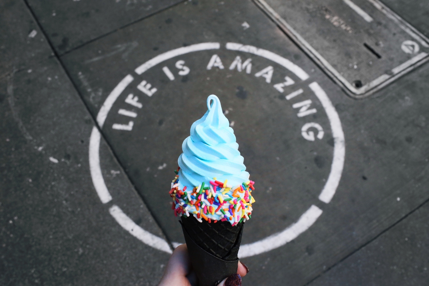
Yesterday, a couple friends and I went out for some ice cream. One of them got a cone that, like the slushy, was a vivid blue in colour – the sort that’s really rare in nature. Seeing that kind of blue in any food item is evocative of CGI screens, which are today both blue and green. The reason to pick one of these colours for these screens was that they are the most unlikely to be present on human skin, so the screen’s blue could easily be substituted with the elements of a computer-generated scene without those effects spilling to the human actors in the foreground. (Studio technicians prefer blue screens for low-light shoots because reflected blue light is less bright than reflected green light.)
Eventually, our group’s conversation turned to blue-coloured foods in general and whether we might have been wary of them once but lost our aversion as we better understood food chemistry and developed newer cooking technologies. The vendor in the ice cream store would have nothing of this, of course, and proceeded to describe how the colour of jamun before and after some chewing changed from black to purple. I didn’t want to argue with him there but his answer didn’t cut it. The cone of ice cream in my friend’s hand was blue pre-chewing, plus I couldn’t think of anything that did turn this shade of blue even after a good chew.
The answer turned out to be a simple colouring agent, but in the course of tracking down its identity, I was able to catch a glimpse of why blue in nature is so rare. The root of the answer lies in high-school physics, specifically in Planck’s equation: E = hv. E is the amount of energy in a wave; h is Planck’s constant; and v is the frequency of the wave. In the visible spectrum, which is what humans can see, blue has the highest frequency, so bluer light transports more energy per wavelength than light of other frequencies. For plants’ leaves, blue light is effectively the most energy-loaded snack, and they absorb all of it. We see plant leaves to be green because the chlorophyll in the leaves absorbs light of other frequencies, reflecting only the green for our eyes. (Curiously, water absorbs light of lower frequencies better, so deeper water looks bluer.)
There is another consequence of plants’ fondness for blue light: the colour of many animals is simply a reflection of the food they eat. Plants don’t usually have blue pigments lying around in their bodies, so animals that eat plants don’t have a natural way to turn blue. Instead, most fauna that have blue colouring on their bodies employ structural colouring. Their bodies are covered in very small structures – like the ridges on the wings of Morpho butterflies, the beads in blue jay feathers and the barbules of peacock feathers – that scatter light in such a way that no frequencies except those in a narrow range escape to the surface. If this range is towards the higher frequency end of the spectrum, the scattered light is going to look bluer to our eyes.

But there are some notable exceptions. A common product of the metabolisation of organic compounds called porphyrins is bile pigments; three such pigments are pterobilin, phorcabilin and sarpedobilin, and their presence imparts a blue colour.
Pterobilin is produced in the bodies of butterflies of the genus Nessaea and in a few species of butterflies of the genus Graphium (G. agamemnon, G. antiphates, G. doson and G. sarpedon). One metabolic product of pterobilin is phorcabilin, which is a blue-green pigment found in the bodies of some Graphium species as well as in the purple-hued Papilio phorcas and Papilio weiskei butterflies. Sarpedobilin is present in small quantities in the bodies of species that have pterobilin and/or phorcabilin – but in higher quantities in the bodies of a few species found only in Southeast Asia (e.g. Graphium stresemanni). These species are thus uniquely able to produce blue-coloured features on their bodies using pigments instead of through structural colouration.
Similarly, many plants’ flowers and fruits (and in lower quantities in other parts) contain compounds called anthocyanins, which impart colours based on the acidity of their surroundings. Delphinidin is an anthocyanin that, in basic conditions (pH > 7), becomes bluer. This is how flowers of the genera Delphinium and Viola get their lovely lilac hues. (‘Delphinion’ is Ancient Greek for ‘dolphin’; Delphinium plants were named thus for their dolphin-shaped flowers, and that’s where the particular anthocyanin got its name.)
Blue corn, however, gets its characteristic colour from a combination of cyanidin and peonidin. The colour of blue potatoes has been attributed to the presence of petunidin and malvidin. Blue cheese is the handiwork of Penicillium moulds. Blue-green algae (including spirulina) get their blues from a protein complex called C-phycocyanin. In plants, phycocyanin helps leaves absorb more light than just chlorophyll can, and later pass on their stored energy for photosynthesis. Cyanobacteria in the ocean use it to absorb sunlight at depths where little light gets through.
The relative absence of a natural pigment that reflects blue light has rendered vivid blues a rare sight in nature – but amusingly enough, there’s at least one story involving scientists struggling to create blue light in the lab as well.
A central concept of semiconductor physics is electron holes: places in the material where an electron could be located but isn’t. Since it’s the absence of an electron, an electron hole denotes the presence of a positive charge. When an electron moves into an electron hole, the system releases some energy. When this energy is in the form of light, the phenomenon is called electroluminescence. The ‘electro-‘ prefix refers to the electric energy supplied to the material to motivate the electron towards the electron hole. Light-emitting diodes (LEDs) are such electroluminescent materials; many of them emit light in the visible part of the spectrum.
By the 1970s, scientists had developed both green and red LEDs that emitted sufficiently bright light with a reasonably good energy efficiency. They had also found blue LEDs but the materials they used emitted light dimly (like gallium nitride doped with magnesium) or at very low efficiency (like the 0.03% of silicon carbide).
A blue LED was important at the time for two reasons. The first, of course, was motivated by the simple question of why blue LEDs were harder to achieve than red and green LEDs (the three being the primary colours). The second had to do with the lucre of mass-market use: when the three primary colours are combined, the resulting colour is white – and white light has a wealth of applications in households and industry. White LED light also incurred, and incurs, a much lower energy cost than white light from other sources. The principal problem was a compound called gallium nitride (GaN): scientists knew it was electroluminescent, that it could emit blue light of sufficient brightness when doped with magnesium or zinc, and that it could operate efficiently even at high voltages and temperatures. However, they didn’t have a way to make gallium nitride crystals that weren’t fragile and didn’t disintegrate into a powder during the growth process.
Researchers took important steps in this direction by developing revolutionary techniques like hydride vapour phase epitaxy, molecular beam epitaxy and metalorganic vapour phase epitaxy. The last proved crucial: in the late 1980s, researchers in Japan used it, together with an electron irradiation technique, to grow the first GaN crystals doped with zinc that had the precise physical, structural, optical and electronic properties required to function as blue LEDs. For their efforts, they received the Nobel Prize for physics in 2014; the ‘scientific background’ document wrote: “Today’s efficient GaN-based LEDs result from a long series of breakthroughs in basic materials physics and crystal growth, in device physics with advanced heterostructure design, and in optical physics for the optimization of the light out-coupling.”

Perhaps the ubiquitous blue of the daytime sky, thanks to the effect of Rayleigh scattering, mutes the wonder that is blue in nature, and that the alienesque ice cream in my friend’s hand was a welcome reminder to not take the hue for granted. (Then again, our cities’ airsheds are also becoming more hazy and foul…) But we may not have much of a choice if trends in food packaging and marketing persist.
The visual effect of the ice cream was to disrupt, in a seemingly fun way, a potential customer’s senses, to snap their attention and get them to taste it. In this ability, it is of a piece with a broader trend in which blue-coloured foods have been transformed from their potential to shock and awe – to invoke a latent sensory wariness of a colour whose only trick was to lie towards one end of the visible spectrum – to a marketing gimmick that, ironically, blunts the surprise of its appearance even on food shelves and in children’s hands. Let me quote at length from a 2018 review article by Charles Spence, a professor of experimental psychology at the University of Oxford:
… the legendary Italian Futurist F. T. Marinetti would serve the guests at his Futurist banquets white wine (Castelli Romani) that had been artificially coloured blue. He didn’t stop there, though, as he would also serve orange juice that had been coloured red and milk that had been coloured green.
Meanwhile, a few decades later, the film-maker Alfred Hitchcock served his dinner guests, including Sir Gerald du Maurier, meals that consisted only of foods that had artificially been coloured blue in a private dining room at the Trocadero restaurant in London. … A similar blue meal was served to the speakers at the Art and the Senses conference held in Oxford back in August, 2006. On that occasion, a blue soup was accompanied by ‘blue’ music – specifically, Miles Davis playing ‘A kind of blue’.
My all-time favourite example of the disconcerting use of blue food colouring comes from a dinner hosted by the marketer Wheatley (1973) for a group of ‘friends’. The latter were invited to dine on a meal of steak, chips and peas (it was the 1970s after all). The only thing that may have struck any of Wheatley’s guests as strange was how dim the lighting at the dining table was. This was designed to help hide the food’s true colour. When the lighting was returned to normal part of the way through the meal, imagine the guests’ horror when they saw that what they had actually been eating was a blue steak, green chips, and red peas. Wheatley gleefully reports how a number of his guests suddenly felt decidedly ill, with some apparently heading straight for the bathroom. …
Finally, here, it would be remiss of me not to mention the fabulous Fanny Cradock. For those who are not old enough to remember, she was Britain’s first TV celebrity chef (a regular presence on our TV screens in the middle decades of the last century). There are reports of her preparing mashed potatoes in all manner of artificial colours, including blue (see Ellis, 2007). In so doing, Cradock was, I presume, trying to make the artificial colouring of food in unexpected colours into something sophisticated/pleasant (given the tastes of the time. …
A few years ago, now, for example, I was on stage with the two Michelin-starred Spanish chef Maria Jose San Roman at one of Spain’s largest gastronomy festivals. We were there to talk about the importance of the senses to dining, including, as one might imagine, the importance of vision (or sight), and specifically colour to the diner’s appreciation of food and drink. To illustrate the point, Maria Jose had prepared pizzas covered in a dark blue tomato-based topping. However, one only need to take a look at the audience’s faces to know how little they enjoyed this particular snack. In a way, then, proving our point. …
Meanwhile, Sakai (2011) experimented with colouring sushi blue. As one might have expected, the Japanese participants who took part in this study did not find the miscoloured fish to be very appealing at all.
I borrowed this idea for a segment about the importance of colour for a British TV show a couple of years back. Several boxes of store-bought high street sushi were dipped (the fish that is) in blue food dye. Even though the sushi itself was perfectly fresh, and didn’t taste any different from normal (given that the food dye had been chosen to be effectively odourless and tasteless), it was virtually impossible to get any of the guests on the show to put the sushi into their mouths!
Fast forward to the 21st century:
What flavour, in other words, does the blue colour elicit in consumers nowadays? In 2010, we attempted to answer this question by conducting a cross-cultural study in which six differently-coloured drinks were shown to young consumers from the UK and Taiwan (Shankar, Levitan, & Spence, 2010). The latter had to say what flavour they expected the drink would have. Relevant here, one of the drinks was a clear blue drink (see Figure 3A).
In this case, the young Brits who took part in this study thought that the drink would have a raspberry flavour (mint and blueberry were the next most common choices). The young Taiwanese participants who were quizzed thought of mint (i.e., mouthwash) instead (the second most popular suggestion was cocktail). Such results clearly demonstrate that the marketers have had some success in convincing the consumer … that a clear blue drink (at least when presented as a soft drink) does indeed signal raspberry flavour.
More recently, we conducted a largescale study on more than 5000 individuals as part of the Cravings Exhibition held at the Science Museum in London. Those who took part were simultaneously shown pictures of blue, green, orange, purple, red, and yellow drinks in plastic cups and had to pick the drink colour that looked sweetest. Interestingly, the blue drink turned out to be the second most popular choice after red (garnering 28% and 41% of the votes, respectively). People appear to bring to mind exemplars when trying to interpret or assess the taste meaning of colour. …
part of the growth of interest in blue foods may simply be being driven by the rise of gastroporn. Photographing a dish that is, in part, blue is certainly likely to create a more arresting image. And, as some have noted, there is little interest in actually consuming some of these dishes [–] that they look good is the thing. Indeed, this was part of the concern that led to the Uninstagrammable Dish.
At present, it feels like it is all about capturing the consumer’s attention. And one way of doing this is through the use of unusual, but crucially, natural colours. … So, ultimately, while blue foods were once written-off, this hue has seen something of a resurgence, though not in the world of gastronomy, where those colours that are more associated with nature would seem to be preferred (e.g., Lightner & Rand, 2014). Ultimately, blue’s introduction into food and drink would seem to be more about capturing the attention of the consumer (be it on the shelf, or on one’s Instagram feed), and very little to do with any attempt to actually enhance the taste/flavour or nutritional value of an offering.
It is for this reason, then, that so few chefs, even those of a modernist persuasion, have been tempted to dish up much in the way of blue food thus far. And while food futurology is undoubtedly a risky business (see Spence & Piqueras-Fiszman, 2014, on this theme), I, for one, can see little reason to believe that this state of affairs will change any time soon.
The ice cream in my friend’s hand, and eventually all over her tongue and teeth, itself was the work of a simple blue gel-based colouring agent, a synthetic one to parallel naturally occurring agents like phycocyanin (which is suited for cold foods with a lot of sugar).
Featured image credit: Fallon Michael/Unsplash.